WPU PRISM LITERARY MAGAZINE
Graphic Designer, 2016 & 2018
 project draft - PR.jpg |  prism cover 4.jpg | 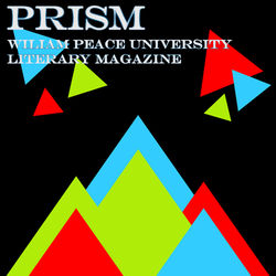 prism cover 5.jpg |
|---|---|---|
 prism cover 2.jpg |  prism cover 3.jpg |
William Peace University has an annual literary magazine called Prism. In 2016, I was one of the lead designers for Prism, a part of the literary staff in 2017, and recently in 2018, I was the sole graphic designer for the magazine, in charge of the layout of the whole project. I’ve included a recap graphic of what I’ve done with Prism in the past, but the rest of the images are from when I was the head designer for 2018.The bottom section is what I’m working on currently for 2018. The staff decided on doing a style based off an actual prism with a back background and a rainbow of color. I worked to turn their suggestions into an eye-catching cover. The design that was ultimately chosen was the rainbow crystal design, a graphic I made myself in Illustrator before adding in the text in Photoshop. Choosing a cover was the biggest step, and after that, I simply had to assemble a template for the rest of the pages in InDesign then add in the literary works with a few little crystal graphics here and there. After going through a few drafts with the Prism's faculty adviser, the final design was sent off to be printed, being distributed about the campus to students and staff on WPU's Showcase day.
JTP SHORT STORY ANTHOLOGY
Graphic Designer, 2017
 anthology 1.png | 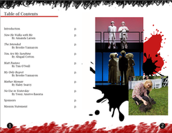 anthology 3.png |  anthology 2.png |
|---|
WPU requires its students to complete an internship in order to graduate. I interned with Justice Theater Project (JTP), a non-profit organization that puts on shows to bring attention to social issues that are “hot” at the time. They are based in Raleigh, but their main performance space is at Umstead Park UCC. "Officially" I was the executive director's assistant, but I mainly worked on graphic design tasks like updating last year's postcard or adding ads into the season program.
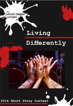
Arguably the largest project I worked on was creating a short story anthology for a young writers contest JTP had held in a previous year. I was given the lead on designing this, only working with Obelia Exum, a graphic designer who usually works at the NC Museum of History. Unlike the season program, I had to create this booklet entirely from scratch and I was given a lot more free reign to make it more “artsy”. The biggest challenge was finding a way to make pages of text look visually interesting. I went with a paint splotch theme to match JTP’s logo and atmosphere of creativity and just ran with it! I’ve learned a lot about graphic design working with Obelia and about how to best represent a client through visuals and design layouts.
WPU SHOWCASE REBRANDING
Logo Designer, 2017
 showcase logo 1 edit.png |  showcase logo 2-2.png |  showcase logo 1-2.png |
|---|---|---|
 showcase logo final with bkgd.jpg |  showcase logo final no bkgd.jpg |  showcase logo FINAL!!.png |
 Evie flyer SHARE YOUR SHOWCASE fix.jpg |  Showcase door signs2.jpg |  Screen Shot 2017-04-26 at 1.32.02 PM.png |
 Screen Shot 2017-04-26 at 1.35.08 PM.png |  IMG_0051.JPG |  IMG_0143.JPG |
 IMG_00002.JPG |  IMG_00001.JPG |
I was part of the Advanced Graphic Design Studio class tasked with rebranding WPU's annual Student Showcase. Showcase is probably the biggest event on campus besides graduation, yet up until 2017, it did not have its own consistent brand from year to year.
One of the most noticeable aspects of any brand is the logo. Naturally, designing an official logo for Student Showcase was very important. Our entire group submitted designs to our client, and she chose which design she liked best which ended up being my design. Thus, it was my job to design the logo for Showcase. The logo went through many iterations in its evolution based on the requirements and feedback received from our client. Most notably, my initial design which features WPU's logo in the "o" of Showcase which I liked best initially ended up having to be near entirely redesigned when it was brought to our attention that that core design element could not be used. So, I was required to come up with something new, and for inspiration, I looked to still incorporating WPU's logo into the design somehow. Student Showcase's brand was in many ways a "sub-brand" to the main WPU brand so I decided to mimic the overlapping letters and color scheme of the WPU official logo in my Showcase logo with the words "show" and "case" to create the main design of what became the final logo for Showcase. Ironically, in my third draft of the logo, I was asked to put something back into the "o" of Showcase, except this time the client wished to put the university's seal in the "o", producing what became the official logo design for Student Showcase. Interestingly enough, I came to like this new design much more than the first draft as it was a bit more professional and sleek plus it was a bit easier to manipulate and add to other deliverables thanks to its simplicity. While I worked to design other things such as a powerpoint template for presenters and some posters, this is, without a doubt, the element of Showcase I am most proud of.
For more information about the whole rebranding process, click this link to go to a separate website I created detailing the whole project start to finish.
VISUALIZE A QUOTE
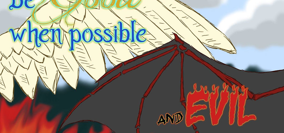
I made this design in Imaging at WPU in which the project was to illustrate a favorite quote using a Wacom Drawing Tablet. I'm always loved the duality of this quote and wished to represent that through a classic angel/demon theme. I drew the wings with the drawing tablet and created the background with the mouse and the smudge tool. The quote itself was made using a few free fonts from dafont.com and layers styles such as outer glow.

PRODUCT MODEL OF POKEDEX
In this project for Imaging, we were tasked with making a product model of sorts in which we were to create some product (real or imagined) and make it look three dimensional. This project was to help us learn about shadows and highlights in design. I made a mobile encyclopedia from a fan-game I had been playing, showing it in both the open and closed position. To help round out the design, I made a gray background with radioactive waste spilled on it, created with a glow and inner shadow effect. The text too has a glow effect.

BUILDING SKETCH UP
This project for Imaging was two parts. We were to make a floor plan or sketch up of a building we designed. I created this house in three dimensions originally through Sketch Up and then exported it as a flat image into Photoshop. From there, I had to apply textures to every surface of the building, using the warp tool to help the perspective look right and the building more realistic. To properly "frame" the design, I made a pale green background with tree silhouettes and a gradient bar across the bottom to further sell the illusion of a tilted perspective.